Monday, February 28, 2011

"Police Brutality" - Project 1 - Nev Granum


Are we supposed to post these here? Not sure. I’ll put it here and if it’s out of place I’ll take it down haha. Anyways….

For this project I wanted to make a work of art first; a poster second, hence the orientation – I thought the topic deserved it. I wanted the work to have many layers and withhold a slew of social messages. The goal was to make it tragic and empowering at the same time – like the topic, it’s horribly sad but also fuels the fires of change.

With my last blog post I chose to feature Kara Walker, a brilliant artist who uses cut out silhouettes to convey her message – I loved both the look and the poetic symbolism behind it. She was the inspiration for the use of the black police target to represent the African American people. The black cut out target is the default police target used. The scoring rubric on the left and hit count on the right are both a part of the target – I cut them and moved them in the piece where I saw fit.

I used the iconic photograph of Birmingham police brutality as the background for the work. I faded it good deal so you have to strain a bit to see the detail – like a faded memory in which you have to relate a present issue to fully remember the whole. Everything in the piece is layered and translucent. I loved both the look of this and the thought of looking through all the layers to see the past and to see that it hasn’t changed. The only 100% solid part is the powerful phrase “Black Is Beautiful”. I used this because I wanted the piece to be empowering, and become a motivational slogan for change juxtaposed on the violence. But it's also a bit twisted because in the eyes of the corrupt police force black is the ideal target for attack, so in that sense, it's beautiful to them.

I am really happy with the way it turned out and hope it has some impact on our society.

-Nev

Sunday, February 27, 2011

The art of Frida is, I think a great example of art that is both self-reflective and socially challenging. Frida explores and expresses her own pain, her own past, and her own relationships, while at the same time challenging some of the gender stereotypes of her time.

Frida is best known for her self-portraits and they are often somewhat shocking. They are also the kind of paintings that I could look at for hours and probably not fully understand all of the symbolism that she uses.

For example, her physical pain as a result of the auto accident that she was involved in is represented in many of her self portraits. However in addition to this personal suffering, she challenges gender roles in her self-portraits by choosing to portray herself in a way that did not conform to traditional standards of feminine beauty. Between her unibrow and her sometimes masculine, sometimes indigenous clothing, she was in a way, consciously or not, rebelling against what society did (and still does) dictate is beautiful and right for a woman.

http://www.google.com/imgres?imgurl=http://www.longhairlovers.com/images/frida3.jpg&imgrefurl=http://www.longhairlovers.com/frida_kahlo.html&usg=__d0bUimdVAAJwFr_PaBWQOvtCgpk=&h=450&w=316&sz=17&hl=en&start=0&zoom=1&tbnid=Nh3rueP6s-KMvM:&tbnh=145&tbnw=108&ei=SVNrTdOTB430tgPQ6IGpBA&prev=/images%3Fq%3Dfrida%2Bin%2Ba%2Bsuit%26um%3D1%26hl%3Den%26client%3Dsafari%26sa%3DG%26rls%3Den%26biw%3D1217%26bih%3D614%26tbs%3Disch:1&um=1&itbs=1&iact=hc&vpx=434&vpy=65&dur=502&hovh=268&hovw=188&tx=104&ty=120&oei=SVNrTdOTB430tgPQ6IGpBA&page=1&ndsp=22&ved=1t:429,r:2,s:0


I think that this fusion of self and societal reflection is really powerful and rings very true because it is not contrived. They are self-portraits and they are an expression of Frida, and they also authentically challenge the gender norms of Frida's day.

By Kate Pritchard

Saturday, February 26, 2011

Dinner for Six by Anoli Perera

anoli.jpg


I found this piece extremely interesting. When I looked at it, I immediately saw crocheted doilies and cob webs. Crocheting doilies is a traditional duty of women, as is dusting, the removal of cob webs, setting the table, and cooking the meals. This piece could represent the slow death of women (wives), caught in the trap (cob web) of marriage with all of the associated duties. The individual strands of the web could be the repetitive motions women perform in traditional roles. You sweep the floor, do the shopping, laundry and cook the meals, just to do the exact same duties again the next day. These roles slowly suck the life from them as they wait for the spider's poison to end the pain. I think the spider would have to be the societal norms that restrict women to these roles in places like Sri Lanka, where the artist is from.

It has me thinking about all that life has to offer and all of the lost potential in societies where women do not have a choice, their plot in life is predetermined by society.


Friday, February 25, 2011

Banksey

I had a hard time finding a dissident artist to talk about who wasn't a street artist because that's what search engines kept directing me toward. I settled on writing about the ever-subversive artist who operates under the name Banksy. This anonymous artist is famous for his satirical and clever graffiti, much of which is politically charged and subversive. I chose Banksy because his work often has a sense of humor to it even when it tackles grim subjects.


The painted dove in a bulletproof vest is especially interesting because it depicts peace being defended from an instrument of war.


Banksy works by using an environment to his advantage. The spots for his grafitti are specifically picked to drive a point home. Juxtaposed starving children on grungy walls by high end stores hits especially hard. Banksy also has several children stencils that he places with violent scenes, depicting them with machine guns as well as toys, an interesting commentary on who is affected by war and how war is treated.

The work is very in-your-face and carries a shock factor to it without being completely gruesome. I think when it comes to art making a statement, if it's so gross that no one will look at it, an artist loses an audience and the chance of spreading their ideas and work around. It isn't going to be an effective controversy, or it can highlight a controversy that isn't necessarily the intended issue.


Banksy's official website is here.


Chaz Maviyane-Davies

"Creating an alternate vision as my expression in a pervading regressive body politic has never been easy, but design is my weapon and therein lies the challenge I call 'Creative Defiance.'"

This week, i've chosen to focus on Chaz Maviyane-Davies. He does wonderful designs for social issues, mostly those of a global level. He also ties in nicely with the articles we read this week, specifically his poster titled, "Dissent is a Right". The piece is very direct without being in your face. If you were to view this poster without any context, you would not immediately think of Iran, but when informed, you can make the connection. For me, this kind of art is the most intriguing. It causes the viewer to think.

Another great poster of Chaz's focuses on UN Rights. It reads, "No one should be subjected to slavery or servitude". With this piece, it is not difficult to decide what t
he focus or subject is, but it is also very visually stimulating. He could have simply wrapped a pair of fists in chains, but manipulating the image to include chains
as hair is really cool.

It's not offense, or gruesome, but it is nothing to take lightly either. I'll admit, I am a sucker for happy mediums. I don't like offending people, but I don't want to create 'something pretty' either. This may be why I find Maviyane-Davies to be so intriguing.

I think my favorite works of his are the graphic commentaries. He seems to have discovered a right balance between visuals and text, something that I have always struggled with. How much do you say? Do you let the image/work speak for itself? Should you provide your audience with bumpers to prevent them from ending up in the gutter?

Chaz Mayiyane-Davies is a very versatile artist/designer. I only wish that more people would use their talents, whatever they may be, to do better. Not everyone can make a career out of changing the world, but you really have to respect those who do. The work they do, on the canvas and off, is incredible. For anyone who's interested, you can check out more of his work on his website.

Mike Nelson's Coral Reef


A room from Coral Reef

Mike Nelson is a British artist who mostly makes installations. While in London I came across Coral Reef, a redux of an installation he first did in 1999, in the Tate Britain. It is hard to describe how his work effects you, but it certainly leaves a lasting impression. The first time I went through it I had a hard time figuring out what was going on -- there was a small room with a couch and a door which led me to believe I had accidentally stumbled into a backroom of the museum. Upon further exploration I realized what I was in -- a labyrinth of rooms representational of capitalism (according to Nelson in this video) and how it relates to the Middle East and other places in general.


Since it is hard to encapsulate a dozen or more intricately constructed rooms in my own words I will invoke the Tate's description:
It's a claustrophobic construction of rooms and narrow corridors, each with a hint of life but decaying in front of your eyes. The sprawling work was first shown in 2001 at Matt's Gallery in London, and is now part of Tate's collection. In this interview the artist explains the ideas and ideologies behind the work, and tells us why he wants the spectator to feel 'lost in a world of lost people'.


While experiencing Tunnel of Oppression today I was reminded of Coral Reef because they both explore ways of living different from our own. They are both a kind of journey you take that force you to look outside your own life and see other ways of life. They both educate and disturb you. It reminds us of the ideologies that don't just govern our own lives but everyone's.


Kara Walker


Hola, rebellious artsy people! Kara Walker is a current artist whose work deals with African American oppression and slavery. She is most well known for using the medium "Pastoral" - large hand cut and hand painted silhouettes placed on stark white backgrounds. This form is all too fitting as the history of what she is telling would be unpleasantly gruesome for the physical realism of these events. The crisp shadows allow the viewer to fill in the often bloody details without the overwhelming presence of gore.
Walkers work has come to prominence for its creative beauty but also for it's uncomfortable relations between slaves and masters. The pieces often contain imagery of violence (slaves to masters, masters to slaves) but also the common sexual relations between the two. Walker also includes animal-human relations that are often held in the same regard. However, all the people. shapes and animals are black silhouettes unifying them to the same "level".
I personally find Walker's work hard to view. I am usually one for "Happy Art" or uplifting at least - Walkers work isn't that, but it's necessary and real . Her work is an unsettling look into the gruesome race-relations of America's grafittid past.

"These are images that lurk in the subconscious, and in her art expose contradictions and tensions of the race in America that have grown up over centuries of lies and insecurities, exploitation and vulnerabilities. Precocious and subversive, Walker's work provokes the catharsis achieved by public as acknowledgement of these suppressed histories and their effect on the psyche."
-Catalog; Walker's SFMOMA show.

-Nev

Sunday, February 20, 2011

Barbara Kruger: text-based criticism


After reading "How to be a Graphic Designer Without Losing Your Soul" and it's discussion of design and it's consequences, I decided to focus on Barbara Kruger for this past week. Graphic design is a key element in advertising, which can be problematic depending on what you're selling. Kruger's work instead of advertising, attacks the selling points of consumerist culture.

Over this J-term, I got to see a few pieces by Kruger in Berlin. Best known for her biting text overlayed on black and white photographs, Kruger comments on consumerism, feminism, and identity. Kruger's educational background and work experience are from the graphic design field, and her own artwork clearly shows this with it's text dependence and arrangement.

The photographs she works with are taken from magazines, which is especially fitting since magazines are often the target of her criticism. Two phrases from Kruger's work "I'm lost without my purse" and "Buy me, I'll change your life" stuck out to me because even though they were written to highlight just how ridiculous that sentiment is, they sound far too much like actual advertisement slogans; I could see them popping up on a billboard somewhere.
More about Kruger and her work can be found here.


Friday, February 18, 2011

We Automatically Control...


Upon googling graphic designers I came across a wonderful french illustrator, Stephane Massa-Bidal. He also goes by Hulk4598 and Rétrofuturs.

From what i've seen, Massa-BIdal uses his art to create commentary on social media. A lot of it, however, focuses primarily on social networking such as facebook, twitter, google, and so on. Some of the work is very aggressive, some a little more subtle, occasionally cute, and always eye catching.

I chose to look at one project, We Automatically Control, which contains 10 illustrations. This series revolves around Google and some of its byproducts. GBuzz, Gmail, GNews, GMap, GAnalytics, GAdwords, GTranslate, GEarth, GAdSense, and GChrome a
re all included. Each illustration appears to be a flag featuring a beige stained background, a colored stripe, an icon/image, and text. Each contains text beginning with the phrase, "We Automatically Control".


The designs lean more towards simplicity but they pack a punch. These illustrations compare Google to Communism. This is a bold statement, but not a difficult concept for anyone who has spent a decent amount of time exploring the internet. If you have access to the internet, you know what Google is and are probably a frequent user of it, or its extensions. I believe Massa-Bidal attempts to ask whether we've become too dependent on Google. Is it even a choice at this point? Or, as this designer is suggesting, does Google control what we see, hear, read, and possibly even think? Suggesting Google has taken over the world, or at least it's wide web, is not such a far-fetched idea.

I would encourage everyone to check out We Automatically Control, as well as his other work. It really is compelling.

Ernesto Yerena

This piece is the work of Ernesto Yerena, a graphic design artist who has a unique identity and perspective as someone who was born in the U.S. and attended school in the U.S., but who spent a lot of his everyday life in Mexico as he was growing up. I believe that this bicultural perspective lends his work credibility and authenticity.
One of the things that I liked about this piece as I was looking through Yerena's work was how it grabbed me. The child's face is central and the stripped blue lines ensure that your eye goes straight there. On further consideration of the piece, I began to feel however, somewhat emotionally manipulated. The words "We are human" printed on the child's hat, in conjunction with "Stop the raids" printed on the child's chest I think force the viewer into coming to a conclusion they might not agree with. There is no room for disagreement on this poster without "losing face" and perhaps more importantly, no room for the audience to come to any conclusion on their own - all of the answers are already there. No person viewing this poster is going to contend that immigrant children and the children of immigrants are not human, and since the statement "I am human" is tied to the call to "stop the raids", agreeing with the first statement assumes agreement with the second, an assumption that may cause resentment among some viewers. People don't like to feel manipulated, or caught, or forced into agreement.
That said, I think that might have been part of the artist's intent with this piece, and I think that it is effective, and a risk that many artists must take. I think that this poster is emotionally manipulative, but isn't that one of the goals of the artist - to elicit emotion. And this poster forces the viewer to confront the dehumanizing system that is our immigration system and ask themselves how a human being, a child, can be an "alien".

By Kate Pritchard

Peter Kennard: Anti-War Photomontagist


(above Defended to Death by Peter Kennard, 1983)

Peter Kennard, born in post-war England, is best known for his photomontages on anti-war subjects.

My favorite image of his is Haywain with Cruise Missiles (1980) which combines famous English landscape painter John Constable's The Hay Wain (1821) with pictures of cruise missiles in the famous rural landscape. The subject the image addresses was a US plan to install cruise missile (armed with nuclear warheads) bases in various locations around Britain. The montage hearkens back to the English love of their countryside and points to the destruction of it by a foreign military base that would be used in global nuclear warfare. It would transform the picturesque countryside to a focal point for mass destruction.

Another of Kennard's most iconic images is the one pictured above, Defended to Death. A gas mask covers the globe with the mouth piece vomiting up an excess of nuclear missiles. The eyes are replaced with an American Star and Stripes on what would be West on a map and its counterpart, the East, replaced with the Soviet Hammer and Sickle. It was updated in 2003 to protest another war the United States was involved in. The update replaces the Soviet Hammer and Sickle with the Union Jack as a protest to the joint US/UK invasion of Iraq.

Identity & Do-Ho Suh


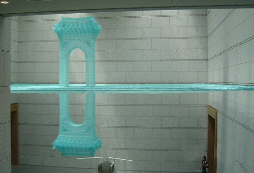
Do-Ho Suh's intricate work dredges up differing ideals of social identity. A Korean - U.S immigrant himself, Suh has dealt with his own international identity and what it means to be a citizen in two countries; the struggle, the loyalty, and the fortunate happiness. His work reflects this - much of it whimsical like the silk-woven homes that are suspended from the ceiling. These delicate dwellings bring the comfort of the nest to wherever Suh might be in the world and his goal is to share it with the viewer.

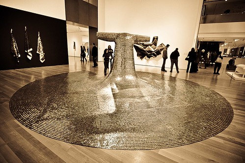
One of my favorite works of Suh's is "Some/One" - a coat of armor made up of over 30,000 dog tags. This deals with the social identity of the individual and that individual working with others for a common purpose. It deals with the loss of individuality as well and the muddled expression of one's self needed to create the shared goal of oneness. Also there is the fact that the medium is "dog tags" and a militaristic theme is then interwoven. Some may see it as a protest against the ways of the military - dog tags are associated with the death of soldiers and thus this becomes a somber piece. These men and women gave their lives for that common goal of oneness, for protection, for that phalanx-like coat of armor. In that light some may see it as a celebration; that loss of identity for the protection of others results in a nation's individuality to shine. However you may see it there is no question that it is a powerful statement that puts into question our social ideals. Note: we are fortunate that this piece is in the Seattle Art Museum and is part of their personal collection. Go check it out in person! It is a humbling experience.

Thursday, February 17, 2011

The Art of Sam Mahon


This week's artist is Sam Mahon of New Zealand and this is the piece that caught my attention. The piece is titled, "Tern for the Worse"


Sam Mahon: "Tern for the Worse"

mixed media: cowpat & resin, NFS

Jenny’s at her window,
the city at her feet,
a coffee cupped in both her hands,
staring at the street.
She wonders if the crowds below,
consider Michelangelo,
or Epstein, or Eliza Frink:
What do the people really think,
she wonders.
In their suburban heart of hearts
is there still room for the visual arts?
She lays her finger tips against
the crenellated scar,
that one unlovely part,
the slow embalming of her heart.
She takes a sip
and feels the bitter taste upon her lip
of crushed black beans and cinnamon,
with a little froth to hide it in.

After viewing the piece, I couldn't quite make out what the white objects inside the head were, so I did some research. I googled "tern, New Zealand" and this is what I discovered:

With a population of around 36 individuals that includes only ten breeding pairs, the New Zealand fairy tern is probably New Zealand's rarest breeding bird.

It is ranked as an endangered species, and carries a "Category A" priority for conservation action. A department of Conservation Recovery Plan is currently in action.


I love the piece, and the combination of the poem and the sculpture. It is a beautifully sculpted human head with white bone/skeletons of small New Zealand terns where the human skull should be. It is as if we don't have brains.
The shapes in the cranium have their beauty too. They remind me of dolphins playfully breaching the oceans surface. What it says to me is that humans, even if we don't know it, are being changed by our actions, our actions that wound or kill other forms of life. This total disregard for other forms of life will take us over, consume us, and eventually be our downfall.
After reading a short quote from the artist, I see the Jenny in his poem as his daughter living in America. She wrote him that "I look around me and everything seems broken." So I envision her living in a large American city, looking out her window at us. Although I realize this could be any large city in many countries. And "the slow embalming of her heart" to me represents what is happening to us all as we watch injustices, war, extinctions occur with no action on our part to stop it. And the "little froth to hide it in" is the froth, perks, little luxuries of our modern life that help us forget what we are doing to our planet and its inhabitants, human and otherwise. Notice that we still drink the bitter drink.
Sam Mahon thinks that art as social activism in main stream society no longer exists. I like his metaphor of art as wallpaper. Below is a short quote from the artist.

"Ever since secondary school I’ve been making political art, although mostly I painted and sculpted just for myself in order to document the beautiful world in which I moved. It was only occasionally that I used images to try and change points of view. But the egalitarian world I grew up in where we would unhesitatingly step into the street to protest Vietnam, Apartheid and American hegemony are long past. We have since somehow slipped into a culture of acquiescence where our sense of social responsibility has been subsumed by individualism. My daughter wrote from America recently; ‘I look around me and everything seems broken.’

Art is no longer seen as a medium for change. Along with all other revolutionaries it has been captured, branded and turned into wallpaper. The dealers and city art galleries and the public art advisory groups do not ask any more what art has to say; they inform art just as a captain of industry informs the shop floor. It seems that the safest place for art these days is the street." -Sam Mahon