Friday, May 27, 2011

Final Project for ARTD287


How sad! Our final post for Design for Social Change.

Working on the last project was sooo much fun... except for the whole finals week pressure of getting everything done. :0
Our team worked really well together. We had a couple of meetings prior to the due date where we shared research we had found, ran poster ideas by each other, and talked about how we would layout the presentation. We followed this up by posting this information on a shared google docs.

We kept in really good contact through our google docs...asking advice from each other and critiquing the posters.

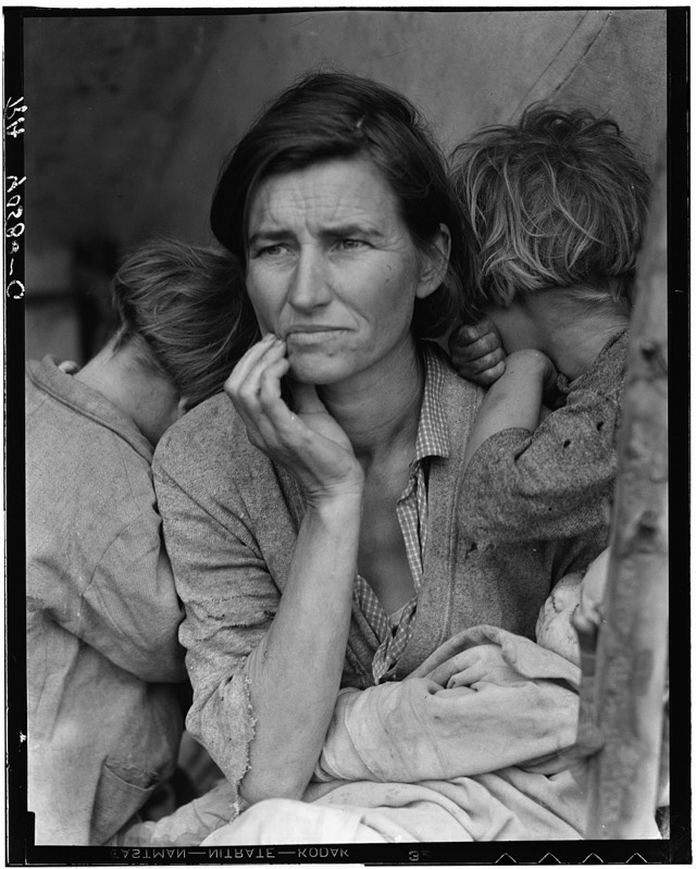
We met at the Digital Media Lab at 11:00 AM on Wednesday. Here Amanda and Kate helped me with photoshop. It was fun... and quite the learning experience. I think we all learned something about how to fill the word CONGO with a picture. Thank you, ladies!!
First we had to find the right picture (the one I had wasn't high enough resolution) and then we had to size it just right for all of the faces to show up and not be cropped oddly. My posters were actually a weird combination of Keynote (power point program on my laptop), InDesign, Photoshop, and Illustrator. After my posters, we did a final critique of the posters.

Then the "Under the Bridge" gang showed up saying we needed a power point presentation... at first Nick (happened to be sitting there) sounded like we didn't, but then he started to vacillate... like he was thinking it over and liked the idea. I didn't think making a Power Point would be that hard. So we went to lunch and did a Power Point and picked our theme songs.

Great posters by all. It was a great class and I really enjoyed working with all of you.
Take care and have a great summer.

Janet

Thursday, May 26, 2011

Final Project!

Well my group has pretty much covered all the logistical stuff -- everything went smoothly and we had a certain visual interplay that was completely non-verbal that I'm still a bit astonished from.

For my work I focused mainly on how to get a fair amount of information across without being too wordy or clunky. I worked hard at eliminating words from the posters and representing the information visually without focusing on one single part of an issue. This approach worked best on my "Price of Pleasure" poster:I wanted to juxtapose pleasant, summery colors associated with vacations with the ridiculous amount of waste created by cruise ships to make the information all the more jarring. I think it turned out well.

Right before my group decided on a topic I was working on a research project on Puget Sound pollution for an oceanography. I came across lots of information that was compelling but very dry. I then had turn the info into a pithy little assignment that didn't do it justice but with this project I felt like my group did justice to presenting the information, at the very least.

Back to design. For my other poster I wanted to focus on the overlap of endangered species and serious pollution and suggest that there was some connectedness between the issues. I kept the species to a minimum because there are 29 threatened or endangered species in Washington and something like 40 Superfund sites, each of which has a different kind of pollution so I abstracted it a bit to show overlap. To keep the design from being too abstract I had to get some cute, cuddly little animals (the pygmy rabbit) and some iconic Washington animals (whales, salmon). The end result was:


I am less happy with this design, though it accomplished the goals I had in mind. There is a bit too much open space and segmentation going on at the top of the design that I didn't really know how to fix. I also ran into trouble figuring out which fonts to use -- which fonts would best capture the tone I was looking for. I like the way the map turned out and the colors work in the design, I think.

Overall, it was a good final project and my group was pretty awesome, though I think any possible permutation of group members would have been great since the class in general was pretty great.

HAVE A GREAT SUMMER!

One last thing

Open to interpretation and therefore the fine art version of our logo.

Under The Bridge


What's beneath the surface of churning turmoil as well as found under a tranquil veneer? Dive under those waves, under the beams of support, and there it is, under the bridge. Our purposeful cephalopod. Rejected logo to the right, better one to the left.

Our group project was designed as a guerrilla arts group. We picked a theme (Puget Sound, baby!), communed in digital space, inspired, fine-tuned, convened in reality and compiled.


Since we were designed as street artists, I decided to roll with in-your-face-imagery. The point was to make the average passerby pause to look at my poster. Robbie mentioned pollution issues surrounding cruise ships, and that begin my jumping point for my first poster. After some researching myself, I was disappointed to see that cruise ships create more pollution that airplanes. I know that save-the-whales is the classic and now cliche example of environmental protest...and hippies. But I wanted to take that and do something new with it. Nev also did this with his fantastic Toxic poster.

This was my first idea:

Which morphed into my actual poster. I wanted to include a spot for facts and information, and make something more "designy" as in "used a grid or something." (Robbie took care of filling our infographic niche)

I also wanted to show the "beautiful majestic whale" as a more human grumpy cetacean.


The whale is angry.


For poster two, I played on childhood memory and ideals with an Arielesque mermaid in a garbage graveyard. I wanted gritty eye-catching, and so the little mermaid was doomed. Really, a mermaid couldn't live in the sound's waters.


Mermaids of course are mythological--just like the fantasy that everything about the Northwest is super environmental. Well, for being a green area, Puget Sound is especially disgusting.

I decided to go without any words like street art often does. As for the technicals, both of my posters were made entirely in illustrator by my hands and frustration.


You were a fantastic group to work with, guys! And our other group did some wonderful work too. Really, we're just an awesome class. It's been great learnin' with all of you!

Final Project


Well folks...bloggin for the last time...so it's time to get sentimental. This project all in all went smoothly. Our group always had great communication due to our online presence. We created a facebook page and the words flowed freely through our keyboards and onto the main "wall". We decided our team would be called "Under the Bridge" - giving recognition to the mysterious and supposedly gigantic Pacific Octopi that reside under the Narrows Bridge. We felt that like our 8 legged friends, we were mysterious, intelligent, strong, and capable of legend.

Our team worked separately but was still close in our continued theme of Puget Sound Pollution Awareness. We all had separate goals and themes that we wanted to create but through our communication were able to tie it together into a project of oneness. Our team was fantastic! We all brought special talents and elements and most importantly had a great time creating for change together.

My project really started with the googling of the word "Toxic" after reading about the toxicity of Puget Sound. A lascivious image of Britney Spears popped up everywhere...needless to say I fell in love with it. I searched and found another image of a Orca Whale as well as the skull and crossbones (I wanted there to be a dark image to battle Britney's beautiful mug). After messing with hue, saturation and opacity it really came together. I absolute LOVE this image and it sparked a want to do more collage based art and imagery. Anyways from there the slogan "This is the sound our orcas know" was put into play. The word sound referring first to the toxicity of Britney but also Puget Sound. I think this poster is great, and one of my favorite works this year.

Poster 2 was also based on a music theme. I loved Britney so much I wanted to keep songs in play. The poster was on loss of habitat and how more building and pollution is causing animals to leave. I'm a fairly large Beatles fan, who isn't? I mean, the Stones are better, but still the Beatles are fantastic. "She's leaving home" seemed extremely appropriate so I did some googlin' and found the perfect image. I used that as the base along with a tope colored background and built up the elements until it looked right. I love the large "70" and how it appears that the eagle is flying into the sunset of the "0". This poster is straight and to the point and I believe it works well.

The fonts used in both posters were based on those used in the Beautiful Angel posters. I wanted a very screenprinted/blocked look. I downloaded custom fonts and adjusted the opacity appropriately until it had a look that I saw fit.

I really enjoyed this project: the work I was able to, the fantastic work of my teammates, the time working with my teammates, and the presentation and work of the "Dr Congo" group. Their project was grounding...they did a wonderful job.

Thanks Lace & Nick for a eye opening class!

Enjoy your summer everyone!

-Nev

Wednesday, May 18, 2011

Social Change Poster

One more social change poster.

Digital Storytelling

First of I just want to say that all of your projects were amazing! The images and the music that you all chose were perfect, and I liked how different the tones of each story were, despite the fact that we were all given the same task and the same topic. I think it captured the fact that there is an infinite variety of ways that youth violence can affect people.

I was not altogether happy with my final project. Sitting in the DMC after a marathon of working on my video for a good 5 hours straight, I was not happy with my audio, but couldn't bring myself to take the time to fix it. At the time I was happy with my decision to not include any music, I thought that it fit with my images and the tone that I wanted to portray. After seeing how much music added to all of your projects, however, I left feeling like mine was a little empty, or at least lacking. So I'm going to go back and add music and fix up my audio because I liked my images, and I thought that my story had potential.

My process for the project was to first get my story cut down to what was really needed. From there I recorded and edited that audio and then I started thinking of metaphorical ways that I could use images. I found that I have kind of a strange tendency to take pictures of my feet when I go places, so I thought that I would use pictures of my feet to symbolize journey and the passage of time. I used the image of the plant because I felt like fear had planted some doubt in the pit of stomach and grew as time passed.

In trying to find music, I couldn't seem to find something that fit the mood of the piece - all the songs I listened to seemed either too sad or too upbeat. But I found a song on a benefit cd for the DR Congo with Congolese women singing and it's perfect.

Norman Rockwell @ Tacoma ART Museum

I just went and checked it out today! Although it isn't blatant social change, it doesn't smash in your head like a 2x4 wielding ogre, it does paint a beautiful portrait of the "ideal" american life and or what american life really is. It is from that awareness in ourselves that social change is enacted. So in that sense, Rockwell is an artist for social change. The collection here in Tacoma portrays a lot of his politically sensitive and or crucial work. -

"American Chronicles traces the evolution of Rockwell’s art and iconography from reflections on childhood innocence in No Swimming (1921) through World War II and his powerful depiction of the Four Freedoms (1942), to consciousness-raising images like The Problem We All Live With (1963), which documented the traumatic realities of desegregation in the South." -Tacoma Art Museum.

http://www.tacomaartmuseum.org/Page.aspx?nid=332

I encourage you all to check it out!

-Nev

Reactions to Digital Story Tellin'


I know I said it, "Yuck!". But, truly, after seeing all your projects I understand how effective a method Digital Story Telling is. It's clear, human, and personal. I really enjoyed hearing, seeing, and reacting to your tales! The process may be a bit...ch-allenging, but the overall product is fantastic.

As for mine, I liked it. I think it conveyed the emotion I was going for. It was a bit sloppy in places, and I wish I would have photographed the whole thing the way I wanted, but it got the job done. I liked the images and the soundtrack but I wish i spoke more clearly...or had Morgan Freeman. But such is life... it was a great experience and I think will be a means of communication worked into my application for grad school...eventually.

Enjoy the sun everyone!

-Nev

Ai Weiwei

Ai Weiwei is a famous Chinese artist who has become even more famous as of late, in part because of his provocative art but also because he was recently arrested by the Chinese government and was not heard from for some time. Just today this article http://www.theaustralian.com.au/news/world/wifes-first-visit-finds-artist-ai-in-good-health/story-e6frg6so-1226058497451 reported that Weiwei's wife had been taken to an undisclosed location and allowed to visit her husband, but he remains in police custody. The article also quotes a Beijing lawyer as saying that Weiwei's arrest was purely politically motivated.

His work is provocative in that some of his pieces appear to be critical of the lack of openness in the Chinese political system, or at the very least encourage Chinese people to think critically about their government and then give voice to their ideas.

In the piece below, "Dropping a Han Dynasty Urn", for example, Weiwei is shown as its title suggests dropping an ancient piece of Chinese urn, and allowing it to shatter on the ground.


I think that this piece is very impactful, which I think is in part because of the title. If you know the title of this piece then you know that what he is dropping is very old, a piece of history, and that knowledge makes the impact of the smash and shattering in the final frame more stirring.

I also think that the piece has a very strong social message, though I don't think that I have enough background knowledge about the history and current political and social climate of China to make any specific guesses as to what message the artist is trying to send.

Some general thoughts that I had when I first saw the piece were that it had an element of smashing tradition, or at least of questioning tradition, given the historic nature of the vase. But this artifact of a past dynasty could also symbolize traditional power or traditional wealth - perhaps questioning the way that power in society has traditionally been allocated.

It will be interesting to follow this case as it progresses, and see if and how Weiwei will be released, or if he will be charged with anything.

Social Change Posters


Here is a collection of social change posters, above is an example.

http://cargocollective.com/jocelynli#719156/Social-Change-Posters


Design: Give

Last night I attended the Design:Give event sponsored by AIGA and SPU.

IT. WAS. AMAZING.


There were three panelists featured:

Stephanie Lorig - Founding Director, Art with Heart

Ben Shown - Exhibition Designer, Experience Music Project

Terry Marks - Principal, Tmarks Design


If you are interested in designers or work done for/with non-profits, please check out the links i've attached to each artist. Sincerely, these people and the work that they create is incredible.

Mother Earth Farms

Hey guys,

You should check this out if you're at all interested in volunteer work. Or even if you just want to read a cool story.

This past Saturday, I volunteered with my gender studies class at Mother Earth Farms down in the valley. We spent the morning planting corn. I Know, i know, why on earth should you care. Well, click on this link i've attached and you'll find an incredibly heartwarming story and the people who helped create it.

Hope you find this project as interesting as I did!

Be The Spark


I both appreciated and was a little let down by this event.
Like many others, I expected this to be a speech from Desmond Tutu with little bits of entertainment thrown in. However, this was an event to celebrate our community, it's people, and our ability to work together. Having reached this realization, I was happy to sit back and watch all of the performances.

I must admit, I was somewhat annoyed. I am fully aware the event was targeted at high school students, but attempting to focus in an area holding 15,000ish people, a lot of which were high school students, is difficult. Instead of paying attention to the acts or presenters on stage, my attention was sidetracked by kids chatting with their friends, wiggling around in their seats, and at times booing people on stage. These are the people the community was trying to reach and it would have been nice if they had been paying attention.

However, I did love listening to Tutu. Like Kate said, I wanted him to be my grandpa. He was funny, inspiring, and interesting all at the same time.

Let Them Eat Cake


Here is the finished project. My digital story: Let Them Eat Cake.
It took many hours to create from beginning to end, most of which were filled with frustration.
All in all, a finished product that I am proud to have my name attached to.
Enjoy the show!

Digital Storytelling Process

Choosing a topic centered on youth violence was difficult for me. I cannot recall every being physically harmed by anyone else. Okay, maybe the occasional punch in the arm from one of my brothers, but no "real" violence. After coming to that realization, I reached a conclusion: violence isn't just physical. Violence can also be verbal, and that was a heavy presence in my life.

So I thought of all the rude comments or remarks that I had heard throughout my childhood, but none of them seemed to resonate as greatly as the comments from my father did.

See, when I was younger, I was a "fat kid". And instead of being bullied by my peers, kids, I was scoffed at by my father. It started with lo-key comments about my weight or eating habits, but it eventually grew into an eating disorder for me. I can recall going the entire day without eating because I was too afraid he would see me. So I would wait until the middle of night when everyone was gone or in bed and I would binge on whatever I could find. When we were on vacation somewhere, I refrain from eating anything at all. Because let's face it, there's nowhere to hide in a hotel room.

I tried to think of a way to present this to the general public, especially children. The most relatable event or time I could think of centered around birthdays and lunch time. And after sharing my ideas with the class, I decided the birthday theme would be most fitting.

Should I show illustrations of skinny young women? evil fridges? empty stomaches? Those images seemed more like scare tactics than story illustrations, so I chose to create demon cakes. Inspiration for this stemmed from The Brave Little Toaster.

It took a lot of thinking and writing and then more thinking and rewriting. But I am happy with the way my story turned out. I believe this is a topic that many can relate to. Some might not consider eating disorders and issue of youth violence. But anyone who ever has or does struggle with an eating disorder knows it is not an issue, but a lifestyle founded on violence from others, and against yourself.

Interview with Iman

I found this interview very interesting. Supermodel Iman has a very unique perspective as she has gone from being poor, to being the daughter of an embassador, to being a refugee.

http://www.youtube.com/watch?v=Mzw509yHiLI&feature=player_embedded

Research for Congo posters

Conflict Minerals are used in cell phones, computers, and almost all electronic devices. The illicit trade in minerals essential to phones and other electronics fuels Congo’s war. Congo is the Saudia Arabia of minerals: gold, tin, copper, coltan (computer & cell phones)

Horrible human rights attrocoties here particularly against women


- didn’t start the war, but now perpetrates it

    • tin (Sn) - used in soldering in circuit boards
    • tantalum (Ta) - stores electricity
    • tungsten (W) - makes your phone vibrate
    • gold - used to coat the wiring in every electronic device

Create a consumer demand for conflict free products!


The rate of Sexual Violence in the Congo is the highest in the world. It’s the most dangerous place on Earth to be a woman or a girl.

5.5 million people have died in the Congo in the last decade.


Walmart largest gold retailer in America. What if Walmart demanded tracability all the way to the mine for all of the gold it sells. Of all of the jewelers questioned by 60 Minutes, only Tiffany & Co. said they trace all of their gold all the way to the mine (Utah). Walmart said they will trace 10% by next year.

Illustrator O'Brien


Tim O'Brien (the artist, not the author) has created many iconic covers and imagery for magazines, books, and newspapers. I thought writing about his work would be timely since he recently created Time's cover on Osama Bin Laden's death.

O'Brien's blog is great, because he posts up his work's progression and includes pictures that were rejected. While the art directors can tell the artist what they want they can't force them to create imagery they don't want to, etc. Coming up with imagery about such a huge event carries a lot of weight.


Tim O'Brien also creates work on his own, such as this portrait of Neda Agha-Soltan, a woman who was killed on camera and became a rallying point for Iran in 2009. O'Brien posted a portrait online and was contacted later by grieving family who used his image at Neda's funeral. Art can create an impact, and is spread in weird ways. More on this event here.

Art Spores

I mentioned the idea of creating green graffiti using mold the other day and caused many scrunched up displeased faces. Well, group, I present to you truly green graffiti. It doesn't use any paints or glue and it's literally green. Also....apparently, I meant to say moss, not mold. Although mold might create interesting patterns and colors! Downside is, of course, asbestos death...Anyway! Behold!

How awesome is that? Credit goes to Edina Tokodi for their lovely handiwork. I like the use of actual plants to spread an artist's message. It's truly practicing what you preach when you're using eco-friendly materials. Also, it can make it look like the earth itself is talking to people.

Guides for how to grow your own graffiti are here and here.

Let's spread green dots like chicken pox

For my campaign, I honed in on POLs, specifically, the party crowd. The party-crowd is characterized by alcohol, frisbee, making duck faces, and playing loud music. Unfortunately, giant, sloppy parties are also characterized as being dangerous. Well, they shouldn't be! My goal was to inject as much green dot paraphernalia into any party situation in order to remind the crowds to step in if/when something goes awry. I read up on the bystander effect and wanted to make gritty and cutting posters based off of events such as the death of Kitty Genovesa, who was murdered as onlookers walked past.

After consideration (which involved spying on party people at the library), I decided that depressing posters wouldn't appeal my target crowd as well. Not that they are heartless, but that a smaller upbeat approach would be easier to spread. Theme-wise, I thought the slogan of "I've got your back" encompassed the green dot movement of stepping in to prevent violence. Also, I thought it was a good phrase to appeal to the fact that we all want to help friends--and want people we don't even know looking out for said friends (and us, look out for us too). Enter my poster. I took many meticulously focused photos of my friend with a green dot button. Luckily, she had the sense to strike a fantastic pose, which worked better than my imagined grin.

Poster to the left, oh how you function so much better.

I'll start with my favorite of the swag lot: ping pong balls. These are ridiculously cheap (plastic wrapped around air) and a party staple. Honestly, they would be used for beer pong, but the university could market them for games. They directly place green dot right into the situations where it's needed. These green plastic orbs could serve to remind people to watch out for everyone at the party.
Also, the tiny detail of the tread on the racket up there was a pain.
As for the rest of the swag, I came up with hats, which are beloved as tacky:

Also on the swag list were fuzzy gym wristbands to target menfolk and/or bring green dot to the gym:


I also picked chapstick for it's gender neutralness and because people totally share it and pass it around:

Color-blind-folded


I did some questioning of the essays we read by Tim Wise, but for the most part his speaking blew me away. 1. He was funny. 2. He used relatable stories to illustrate his points, like with his gumbo story. and 3. He had some new approaches to the topic of racism that I hadn't heard before.

I now understand that his essays that had grated on me were written in response to certain things that tea party politicians (and friends) had said, and context is everything for argumentative essays. One of the things that struck me was the idea of white people who want to go back to the 50's or an earlier era due to the "politics" or supposed "tax situation" of the time. Well, these earlier time periods also happen to come with a giant dose of racism. It also ties in with the Southerners who cling to the confederate flags; whether they intend to or not, wishing to go back to these times comes with the bad too--slavery, injustice, cruelty--these can't be ignored. Skipping over these facts, ignoring this part of history, is racist. I had thought to play off of nostalgia with something similar to Lex Drewinski's piece, "Nostalgia":


But I couldn't come up with anything comparable. I went through my jotted notes of things Tim Wise had said that stuck out, and I decided instead to focus on the concept of being "color blind." The concept of nostalgia and being "racially colorblind" both deal with the issue of ignoring race--by denying it's existence or by forgetting it. This in turn propels racism forward. Since I have a tendency to take phrases literally, I came up with this image:
It took me some toying around to pick the expression I wanted. I settled on a bit of a smug "I'm so tolerant I don't even see race. I mean, sure, it means I could be denying part of who you are as a person, but I'm white so I don't really have to care, do I?" smile. Or at least that's what I was going for. People of privilege can exist without being aware of those who aren't--not that they should. It's yet another privilege that can be added to the injustice tally when it comes to race. I think my image's message is straightforward and could serve as a blog icon or header for an article about the same topic. So, for this purpose, my blunt style managed just fine.
(Thanks to all for chatting about how I could work some subtleness into the future though!)

Tuesday, May 17, 2011

Let the Blogging Re-begin

Are all of you prepared for Becky's late night blogathon? Well, you better be! It's absurdly late, but here nonetheless. And so, I will begin these posts with a tale from way back when we did a little thing known as (drum roll) project one:

For the tunnel of oppression project, I decided to focus on gender after scrapping my first poster which was all about religion. Since I've been burned by religion in the past (also, I'm atheist), my original poster was guilty of using stereotypes and I was worried that without my accompanying explanation, it would just come across as,well, mean. I actually think that the image looks really cool (there is fire, so obviously it's cool), and for my first illustrator venture, I'm pretty proud. But especially after visiting the tunnel, I was hesitant to point a finger at one group of people unfairly.

Sooo, we get the one to the left instead. I always found it
weird that the very items that mark us
as human mammals are edited out and portrayed as "gross" on magazines. For instance: pores, hair, wrinkles, shine marks on skin, and a recent trend-- knee caps. Seriously. Oh yes, now these legs are unachievable and therefore attractive. I can follow the logic of photoshopping out zits, scars, and third eyes or whatever because they're viewed as unhealthy, but the alteration of things which are perfectly fine is sick. I'm okay with the fact that companies offer up beauty products, but the way they often market them is destructive. They need to redo their marketing which targets women and causes all sorts of messed up views on what's attractive.

Things I learned from this project: Illustrator is hard to use. Label objects that could be misconstrued (the bottle in my poster is clearly a foundation/make-up bottle to myself, but some people read it as peach-goo milk???). Determine whether or not your project could be misconstrued completely (see unused poster) before you actually draw the entire thing.


Monday, May 16, 2011

Some More History: Social Realism

For a long period in European (and by extension, American) art artists refused to faithfully and realistically portray the everyday world that most most people in Europe lived in. This changed in 19th century France with the creation of the social-realist movement. Gustave Courbet used a very realistic style of painting to show country funerals, laborers, and more. One of his most famous works is A Burial at Ornans (pictured below) painted in 1849.


The painting showed the country folk as the artist saw them (he grew up there) instead of using them as actors to act out grand historical narratives. It was a glimpse into life outside the city in a time of growing urbanization.

One of Courbet's followers, Jean-François Millet, took up the movement in the painting The Gleaners, which depicts three women gleaning. Gleaning was the the taking of crops left behind after a harvest on a commercial farmland. Depicted is the stark reality that all that some people have is the opportunity (if you can call it that) to pick like scavengers over an already harvested farmland. Millet attempts to show how hard and oppressive life is for many of France's people and is one of the first to do so.


Social realism was picked up in America in the time of the Great Depression. This new social realism included both photography and painting and is typified by the photo Migrant Mother, by photographer Dorothea Lange. The photo came to represent the Great Depression in the minds of Americans even to this day.


Social realism works to inform people and change people through strong, emotional images of real people and the struggles of their lives. These works aren't just about power and beauty, they are about real people who struggle to live. These are informative works, as well as artistic. I think social realism informs a lot of art for social change, and while it is from a bygone era, there is still a lot we can learn from these artists and their works.

Saturday, May 14, 2011

The Arch


I just wanted to share with y'all how much I enjoyed last nights event. I don't think I've ever been at such an uplifting gathering, or should I say Minga, before. To see the enthusiasm for change throughout everyone there surely tinged me an optimist for the future. For the first time in my young life I was proud to be from the Tacoma area, a pride I never thought I would feel. Also, extremely proud to be a student at PLU! Our community played a wonderfully large hand last night and it was magical to see school pride so afloat. Craig Kielburger was outstanding; I thought his story and his passion was really incredible. The Arch; its easy to see why he is the Arch. He's so captivating! I found myself waiting on every word he flawlessly delivered. Such a tender but strong man, and though his story was very biblical, i feel it's a message that can affect many a group. I don't consider myself religious in the least bit, but his message rang universal with me. I feel inspired!

I took the picture with my phone, sorry for the bad quality. Tacoma was sparkling after "Be the Spark"! Thought it was neat-o.

Anyways, just wanted to share some thoughts.

Have a great weekend everyone!

-Nev

Friday, May 13, 2011

ART 21

Hi everyone,

I wanted to share this link as well. It the PBS art series Art 21. It follows and interviews artists in the 21st century. I find it absolutely fascinating.

http://www.pbs.org/art21/

Hope you Enjoy!

-Nev

I'm seeing Green Dots...


Ello,
For project 4, the green dot project, I wanted to build a product/activity campaign that would get people involved and excited about spreading green dots. Green Dot, the anti violence organization, wanted a 5 or more piece campaign that would encourage people to spread green dots while also getting the green dot name and symbol across. Overall, I wanted the project to be very non threatening, very non imposing, so the way the products were displayed would also subliminally state what the green dot organization was about.

First I created a "New Green Dot" using the iconic PLU symbol of the rose window. I wanted to make a new logo that incorporated both PLU and Green Dot. Second were the certified organic PLU green dot stickers; these were a toungue in cheek poke at green dot as many people think they are a "Green" organization, but they also highlighted that green dots at plu should be natural. Third were the green dot sporting balls with the idea of pass the green dot back. Fourth was the green dot shot glass. This was a tricky topic but I believe getting straight the root of violence, in this case drinking, will help solve the problem. Fifth was the green dot stress ball, again going straight to the problem and serving as a reminder and release of stress. Sixth was mass organized group games that would get everyone involved and spread the green dot name.

I enjoyed this project immensely. It felt great working for a client. Have a wonderful day!

-Nev

A Little History: The WPA


While current art and design for social change is certainly more important as it is meant for a contemporary audience and contemporary change, it is also important to look at some of the history of art for social change and well being. The first thing that pops into my head when I think about the subject is the Works Progress Administration (later Work Projects Administraion, WPA). The WPA did many things for social betterment throughout the Great Depression but what I always remember is the artists they commissioned for public works.


Most iconic of these artists and their work from the period is Diego Rivera. Rivera, a Mexican artist, had moved to the United States around 1930 and was commissioned to make some murals in Detroit in 1932. Titled Detroit Industry, the series of murals depicts the Ford Motor Company and celebrates its workers, in effect giving the success of the company to the workers and helping them to acknowledge their own importance in a time of widespread unemployment and financial crisis.


Rivera is thought to have been the inspiration for the entire WPA program, which besides employing artists to create public works employed millions of unemployed laborers ,created roads and parks, and distributed food and clean clothing to unemployed workers and families.

Bionic Yarn

The clothing industry is a design industry. Clothing is Art. Bionic Yarn is looking to change the way we think about sustainable clothing; changing the design and the fashion society.

http://www.youtube.com/watch?v=NLcuL24R-3c

I'm a huge Pharrell fan so I find this supremely cool.

Enjoy!

http://bionicyarn.com/

-Nev

Local Artists for Japan

Hi everyone, I thought I would share this link. http://artistsforjapan.blogspot.com/

A very cool collective of local and abroad artists looking to make a difference.

-Nev

Monday, May 9, 2011

Compostmodern 2011


Christopher Simmons at Compostmodern '11 from AIGA San Francisco on Vimeo.

Christopher Simmons gave this presentation at Compostmodern 11 in January this year.

Simmons is a designer, writer, educator, design advocate, and principal of the noted San Francisco design office MINE™. Simmons is an adjunct professor of design at the California College of the Arts, a frequent judge and lecturer on design issues around the country, and the author of four books. His most recent book, Just Design, focuses on designing for social causes.

Compostmodern 2011:: http://compostmodern.org/

If you are interested in the ideas of Compostmodern, PLU folks were there and are willing to talk to you!
JP Avila, Chair of Art Department (jp.avila@plu.edu)
Chrissey Cooley, Sustainability Manager (cooleycs@plu.edu)

Sustainability and Design


Designers Accord - Sustainability in 7 - Allan Chochinov from Core77 on Vimeo.

Sustainability in 7 Series

Allan Chochinov makes moves to setsthe record straight on seven common misconceptions about sustainability and the discipline of design. Definitely a must-see for students interested in designing a better, more sustainable prosperous future.

For more of this sustainability and design talk; visit the whole Sustainability in 7 Series videos here.

Friday, May 6, 2011

Congo/Women

Hello friends,

Here's the link to an exhibit of photographs of women from the DR Congo, as you might have guessed from the title: http://congowomen.org/

I really like this project because I think that the photographs are fairly respectful of the women. I think it can be a difficult line to discern between showing suffering that is necessary for the world to see, and using others' suffering to tell a story that maybe isn't yours to tell, or to make art that is impactful.

I think the photography is stunningly beautiful and does a good job of both showing suffering but also resilience and beauty and strength.

Thursday, May 5, 2011

Tim Wise Project: Redux

After working on the Tim Wise project, in which we were asked to create images to supplement Wise's text heavy blog, I had a chance to re-work my image a bit with the help of Lace. After the images I'll run through what was changed and why.


The original version

The redone version

As you can see there are some font changes, object movement, and a more detailed "Welfare Queen" with a backdrop. I changed the fonts to differentiate the main text more from the font I used for "TV Star." It makes the message visually different from the two examples I use to illustrate the double standards.

Then there's the "Welfare Queen." It was pointed out to me that this part of the design was lacking when compared to the "TV Star" and it's not hard to see why. In the original the teen mom and her infant are given a context -- the TV -- and have simple bodies while the "Welfare Queen" and her child are disembodied and on an abstract background. To remedy this I added bodies to the faces. That was the easy part. The hard part was figuring out what to put behind the mother and child. From my research I knew that the stereotype of the "Welfare Queen" was invented in Chicago. With that in mind I searched for urban skylines to use as an outline for the silhouette I eventually made. Most skyline photos are cluttered and have too much overlap to make a good silhouette. I wanted to work Chicago in but the only iconic part of their skyline is the Sears Tower, which is much taller than the buildings around it and makes for an unbalanced silhouette unless the photo is from a very particular angle. I was lucky enough to find a photo of Chicago that fit my criteria, but it is still hard to make out the shape of the Sears tower, as it is mostly obscured by the mother's head. Once I had found the photo, all that needed to be done was trace the buildings and choose a color that fit the scheme already established in the design.

What do y'all think? Better? Worse? Both better and worse?

Wednesday, May 4, 2011

Project #4

I allowed myself to have absolute fun with this fourth project. Instead of creating posters about preventing violent situations I have almost no first-hand experience with, I decided to go with something that resonated a little closer to home: road rage.

I am a commuter student. Four days a week I drive half an hour out to PLU, and usually longer to get back home (due to traffic). That is an hour+ i spend in my car and on the road, each and every school day.

It took me a while to come up with an image to base my campaign off of. Obviously, I couldn't rely on just the green dot. But I knew that I definitely wanted to keep it incorporated. After clicking through pages of google images, I decided to visualize myself in my car, driving to and fro school.

What do I do when I get mad at other drivers? Well I usually begin by muttering comments aloud, instead of using the car horn like any other normal driver would. And if i'm feeling especially sassy, I give them a thumbs up. I find people are either happy to see this, or they are even more angered by the thumb than they are the finger.

And so my campaign was born.

I found a thumbs up graphic online and used it as inspiration, created my logo in illustrator, and then compiled each graphic onto two promotional posters made in indesign.

Available merchandise (only graphically speaking) includes an antenna ball, a key chain, a window decal, right and left thumb horn stickers, and lastly, a bumper sticker. I tried to keep a relative flow throughout the campaign and I made it a point to not overpower any of the items with too much text or extra decor.

I can fully admit, this has been my favorite project so far. Perhaps it was because I felt like I was the most in control of the media and the direction it went than with any of the previous projects. I would absolutely recommend using this project again. Maybe not just with green dot but any other PLU campus based campaign.

Storycorps: Populist Digital Storytellers

Storycorps is an organization that interviews everyday folk from across America and turns their conversations, anecdotes, and lives into digital stories. Not all of the stories are animated -- many remain as just audio files -- but they are all fascinating. Everyone has a story to tell and Storycorps is honoring that.

Oral traditions were said to have died or been dying by critic and philosopher Walter Benjamin nearly a century ago in his essay The Storyteller: Reflections on the Works of Nikolai Leskov. Benjamin wrote extensively about the positive and negative effects of technology on various arts and is worth reading to this day, but I digress. While to him it may have looked like oral storytelling was dying in the 20th century due to newspapers, radio, and television, it seems today as if technology is taking us full circle with storytelling growing again with the help of the internet and new audio technologies that make recording and editing much easier and cheaper.

Back to Storycorps: here's an animated short wherein a WWII vet recalls the Battle of the Bulge.

Obey x Shepard Fairey x Obama?


Shepard Fairey is more than just that guy who created that iconic image for Obama ^ that most definitely aided The President in his election victory. Fairey first came to prominence through the Skateboard scene designing decks and clothing. He then moved from there to his notable Andre the Giant image that read "OBEY". The images asked society to question their surroundings and how their lives were being governed. Fairey had struck street art gold and the image spread throughout the world, causing each different society and culture to react. The image was printed on clothing, stickers, skate decks, you name it the image was there, looming over society, enacting change.
Fairey's next mega success came with the iconic "HOPE" image for President Barack Obama's candidacy. The New Yorker proclaimed that it was the most iconic american image since "Uncle Sam Wants You". Fairey, through his art, changed the American political landscape; an act that most social change artists would die for. Obama had this to say with regards to Fairey: "I would like to thank you for using your talent in support of my campaign. The political messages involved in your work have encouraged Americans to believe they can change the status-quo. Your images have a profound effect on people, whether seen in a gallery or on a stop sign. I am privileged to be a part of your artwork and proud to have your support." – Barack Obama, February 22, 2008.

Social change through art at its finest! Have a fantastic day!
-Nev

Happiness x Understanding = Takashi Murakami


(Insert Japanese "Hello" here)
It's gorgeous today; lets focus on an artist that makes me happy, that changes society through happiness, understanding, and mad business skills. Takashi Murakami has been one of my favorite artists for sometime now. I love his colors and flamboyancy of his work. When I look at them I can't help but be happy! They are so beautiful and are filled with childlike wonderment. He is one of the Art Worlds richest living artists, partly due to his amazing talent but also due to his skills as a business man. Murakami has created and entire consumer culture behind his art. He has made toys, movies, home accessories, watches ect. He has worked with major fashion designers, most notably Louis Vuitton. However, his fine art has deeper meaning, more than just their beautiful appearances may convey. I recently purchased a book of Murakami's show at the palace of Versailles in France; it's simply incredible, and if any of you wish to borrow it let me know! Anywho, the piece titled "Flower Matango" (Flower Monster) depicts a modern day version of an ancient monster that would sprout flowers because of an over-ingestion of mushrooms. In the modern Japanese context, the mushrooms are the two bombs dropped on Japan that ended WWII. Their culture ingested those mushrooms and it was horrific, but now they sprout a new culture, one filled with color and happiness! I almost tear up at the beauty if this piece and what it means to Japanese culture. Social change through awareness, understanding and happiness; this is the way I believe it should be done.

Tim Wise x Project 3


Time to take a voyage back in time to Project x 3! The Tim Wise lecture was grounding. I walked in expecting it to be overtly intense, unenjoyable, and unbearably heavy. I was pleasantly surprised in the reality; it was still intese, yes, very, but it was enjoyable, informative, and even funny! One thing Mr. Wise said that really caught my ear was that a white man holding a High School degree was equivalent in todays workplace to a person of color holding a college degree. I chose to center my third project on this fact.
Unfortunately I didn't get the opportunity to share this project with you all in class. History tells me I tend to be a space case, some might even say worthy of NASA, but still, I apologize for not having it in on time. That being said, I am extremely pleased with the way the work turned out. The poster depicts a white hand (top) and a person of color's hand (bottom) both reaching for diplomas. The white man reaches for a high school diploma, the person of color for a college diploma. Everything in the image looks equal, it isn't until you look further and dive down into the meaning that you notice something is wrong. It isn't equal at all, in fact, it's extremely messed up. How can our society stand for this? The diplomas themselves create a large "=" sign; the subtle X in the background adds both a nice graphical element, and the affirmation that everything is NOT equal.
I really enjoy this work and how it unravels itself, I hope you do too.
Thanks!
-Nev

Tuesday, May 3, 2011

Writing Life Stories

Thank you, Becky!

Becky loaned me her book, "Writing Life Stories" to help me with my narrative story for youth violence. I am half-way through the second chapter where they have the reader do exercises. The first exercise was to draw your childhood neighborhood. I grew up out in the country and didn't have any neighborhood friends or hangouts, but I drew the ranch. Then you were suppose to write a story that happened in the places you drew. This is the story prompted by my map. I am looking for feedback, so what do you think?

One day, when I was about 13 on the ranch I grew up on, the adults were gone and the mice were going to play. Although I always thought the mice that weren’t my real brothers...the ones that came with my mother’s current husband, were really just playing with my brother. They obviously had no regard for his well being. I don’t know if I can say they were playing with his life. Could he have died from this stunt? I do know he could have been seriously hurt, scarred for life. What am I saying? He probably does have scars from this day. The game they were playing involved a car. An old nondescript grey/beige car with a rounded hood and fenders. Mitch was probably around 13 and his younger brother, Chuckie, was probably 11, same as my brother, Robert. So, too young to be driving, but you don’t need a driver’s license on the ranch, especially when the adults are away. Mitch was driving and Chuckie was riding shotgun. My brother Robert...he was on top of the car, spread eagle, holding on to the car roof through the open driver’s and passenger’s windows. And at 11, he was barely able to reach across. I became aware of the game looking out from an upstairs window.

What kind of male adolescence taunting had they used to get my brother up there?

Mitch was probably driving with his foot to the metal all the way up that mile-long, dusty, gravel road that leads to our house. As the road gets to the house it takes a slight curve to the left and continues up to the barnyard. It was at this curve that they lost him. Robert flew off and hit the gravel. He is very lucky that he didn’t hit something else... like farm equipment parked between the shop and the road. Robert came into the house. I am sure the sight of him made me weak in the stomach. His face and hands were covered with blood, blood and gravel. Dozens of tiny pieces of gravel were imbedded in his face and hands. He was asking me to clean him up before Mom got home. All he was worried about was getting in trouble. So I did. I picked every one of those pieces of road out of his face and hands and cleaned his wounds. I don’t recall Mom ever finding out what happened. I’m sure Robert came up with some excuse for his wounded face...and the excuse was good enough for her.

I’m also sure my two step-brothers thought this was very funny. It wasn’t lost on me, even at 13, that it was Robert on top of that roof instead of either of them. I hope it wasn’t lost on him.